You must add the .active class to one of the slides, otherwise the carousel will not be visible. Also be sure to set a unique id on the .carousel for optional controls, especially
if you’re using multiple carousels on a single page. Control and indicator elements must have a data-bs-target attribute (or href for links) that matches the id of the
.carousel element.
use a context so that if this is called from within another context or a gsap.matchMedia(), we can perform proper cleanup like the "resize" event handler on the window
The returned timeline will have the following methods added to it: osmo.js ➪ // project slider
next() - animates to the next element using a timeline.tweenTo() which it returns. You can pass in a vars object to control duration, easing, etc.
previous() - animates to the previous element using a timeline.tweenTo() which it returns. You can pass in a vars object to control duration, easing, etc.
toIndex() - pass in a zero-based index value of the element that it should animate to, and optionally pass in a vars object to control duration, easing, etc. Always goes in the shortest direction
current() - returns the current index (if an animation is in-progress, it reflects the final index)
Add .carousel-fade to your carousel to animate slides with a fade transition instead of a slide. Depending on your carousel content (e.g., text only slides), you may want to add .bg-body or some custom CSS to
the .carousel-items for proper crossfading.
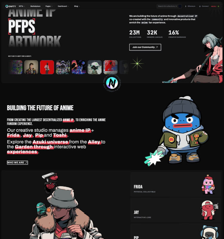
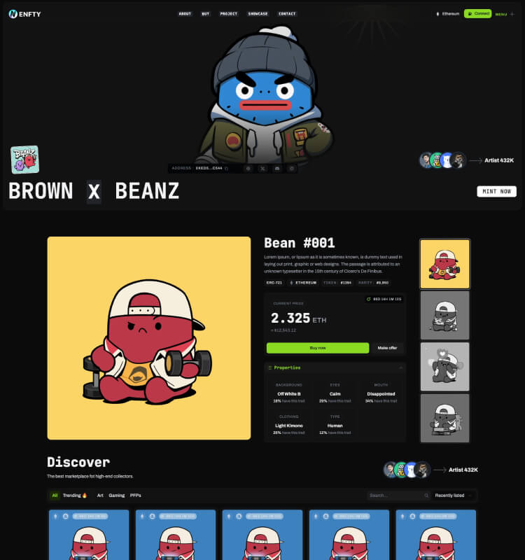
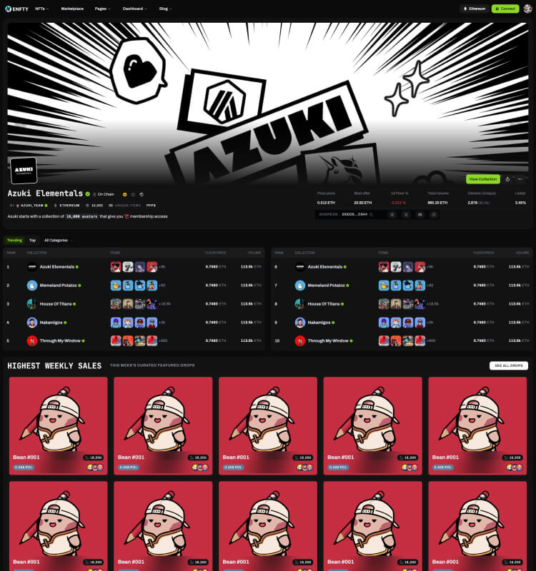
Lorem ipsum is placeholder text commonly used in the graphic, print, and publishing industries for previewing layouts and visual mockups.

Lorem ipsum is placeholder text commonly used in the graphic, print, and publishing industries for previewing layouts and visual mockups.
Lorem ipsum is placeholder text commonly used in the graphic, print, and publishing industries for previewing layouts and visual mockups.

You can add indicators to the carousel, alongside the previous/next controls. The indicators let users jump directly to a particular slide.
.carousel-control-prev, .carousel-control-next class on the previous/next arrow element..carousel-indicators class on the previous/next indicator element.


